Calligraphy for Beginners
A supply-first guide to starting calligraphy: the four beginner paths compared, why paper causes most early frustration, holder types, the seven basic strokes, and a 15-minute practice structure.
Updated
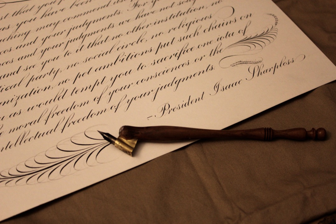
Most people who try calligraphy quit in the first two weeks, and almost none of them quit because they lack talent. They quit because their ink feathered on the wrong paper, their nib caught and spattered, their brush pen frayed after three days, and they concluded from all of it that their hand was the problem. It usually was not. Somewhere in that setup there was a variable failing, and nothing in the beginner guides they read told them which one.
I am not a master calligrapher and I will not pretend otherwise. My professional background is in office supplies and workflow, and after years of specifying paper, pens, and ink for teams as a Certified Administrative Professional, what I bring to calligraphy is the diagnostic habit. When a page comes out badly, there is a finite list of variables that could have caused it: the tool, the tip size, the paper surface, the paper weight, the ink, the holder angle, the pen angle, the pressure, the speed. Isolate them one at a time and the problem resolves. Blame your hand and you learn nothing.
This guide takes that approach. It covers what calligraphy actually is, the four realistic ways to start, why paper is the single most misdiagnosed variable in the whole craft, how nibs and holders work, the seven strokes every script is built from, and a 15-minute practice structure you can run on a weeknight. Read it once through, then pick one path and stay on it for a month.
What Calligraphy Actually Is (and Why It Isn’t Handwriting)
The single most useful mental shift for a beginner is this: calligraphy letters are drawn, not written.
Handwriting is a continuous motion optimized for speed. Your hand moves, the pen follows, and the letterforms are whatever your muscle memory produces at that pace. The goal is throughput. Legibility is a constraint, not the objective.
Calligraphy inverts that. Each letter is assembled from a small number of deliberate strokes, most of them made with a pause between them, at a speed that feels absurdly slow the first time you try it. A lowercase “a” is not one gesture. It is an oval stroke followed by a downstroke, with the pen lifted in between. You are constructing a shape, and construction is slow.
This is why people with beautiful handwriting are often frustrated beginners and people with terrible handwriting are often quick studies. Good handwriting is a fast, automatic habit, and calligraphy asks you to suppress exactly that automation. The person who has no automatic habit to suppress has less to unlearn.
The practical consequence: if your calligraphy looks rushed and uneven, the fix is almost always to slow down by half, lift the pen more often, and stop trying to connect letters. Speed comes back on its own after the shapes are reliable. It never arrives by being attempted early.
The Four Beginner Paths
There are four realistic ways to start, and they differ in cost, setup time, and what they eventually lead to. Nobody else lays these out side by side, so here they are.
| Brush pen | Pointed dip pen | Fountain pen (stub or italic) | Faux / monoline | |
|---|---|---|---|---|
| Setup time | None | 15 minutes per session | Under a minute | None |
| Works on cheap paper | Mostly | No | Sometimes | Yes |
| How thick strokes are made | Pressure on a flexible tip | Pressure spreads the nib tines | Fixed nib width plus pen angle | Drawn in by hand afterward |
| Learning curve, week one | Gentle | Steep | Gentle | Very gentle |
| Leads to | Modern brush lettering | Copperplate, Spencerian, modern pointed pen | Italic, Gothic, Uncial, Foundational | Understanding where thicks belong |
| Main frustration | Tips fray fast on rough paper | Ink control, nib catching, spatter | Limited stroke contrast | It is a drawing exercise, not a writing one |
| Ongoing cost | Replace pens regularly | Nibs and ink, both cheap | Ink only | Nothing |
Read the table by the row that matters most to you. If you have twenty minutes tonight and want to make something, the brush pen or faux column is your answer. If you want Copperplate specifically, the dip pen column is the only one that gets you there and you should accept the steep first week rather than trying to approximate it with a brush.
Choosing Your First Tool
Work backward from what you actually want to produce.
Envelopes, place cards, and wedding stationery. These are traditionally pointed-pen work, but modern brush lettering is now equally common and far easier to start. Begin with a brush pen. Move to a pointed dip pen only when you want the fine hairlines that a felt tip physically cannot produce.
Journaling, headers, and bullet-journal spreads. A small brush pen and a monoline pen cover nearly everything here. Most of what looks like calligraphy in a well-made spread is brush lettering for headers and neat monoline for body text. Our journals guide covers which books have paper that survives both, which matters more than the cover design does.
Signage, chalkboards, and posters. Faux calligraphy is the right technique. You are working large, often on a surface no nib will touch, and drawing the thick strokes in by hand is the standard professional approach rather than a shortcut. Practice it first on paper with an ordinary pencil.
Traditional scripts and historical hands. Broad-edge work (Italic, Uncial, Gothic, Foundational) is best started with a stub or italic-nib fountain pen, because you get the correct letterforms without the ink management. Pointed-pen work (Copperplate, Spencerian, Engrosser’s) requires a dip pen and there is no substitute.
Art and illustration lettering. Start with faux calligraphy in pencil, since you are designing letterforms rather than writing them, and a mechanical pencil with a soft lead gives you the erasability that the design stage needs. Add color later.
Paper: The Variable Beginners Blame Themselves For
Every guide says “use smooth paper.” Almost none explain what goes wrong when you do not, which means beginners cannot recognize the failure when they are looking straight at it. Here is the mechanism.
Paper is a mat of cellulose fibers pressed together, and liquid ink interacts with it in three distinct ways.
Feathering is ink wicking sideways along the fibers after it leaves the nib, so a crisp stroke develops furry, branching edges within a few seconds. It is caused by insufficient sizing, which is the starch or synthetic coating applied during manufacture to seal the fiber surfaces. Uncoated and recycled papers are undersized or unevenly sized, so the ink travels. If your hairlines look fuzzy rather than sharp, this is what you are seeing, and no amount of technique will fix it.
Ghosting is ink visible from the reverse side of the sheet without having physically soaked through. It is a function of paper weight and opacity. Lighter sheets are more translucent, so a heavy black stroke reads faintly on the back. Ghosting is cosmetic and only matters if you write on both sides.
Bleed-through is ink physically penetrating to the back of the sheet, and often to the sheet below it. It happens on thin, absorbent paper with a wet ink or a heavily loaded nib. Unlike ghosting, it ruins the reverse side.
Two numbers describe paper on the packet. Weight is given in gsm (grams per square meter) or pound bond in the US; roughly, 20 lb bond is 75 gsm, 24 lb is 90 gsm, 32 lb is 120 gsm. Finish describes the surface texture, from “smooth” and “ultra smooth” through “vellum” and “laid” to genuinely textured art surfaces.
For calligraphy practice you want smooth finish first and adequate weight second. A smooth 24 lb to 32 lb laser paper is the cheapest reliable practice surface there is, and it is the reason serious calligraphers buy printer paper by the ream rather than art paper by the pad. If you prefer a bound book so the practice accumulates in one place, look for a notebook whose paper is described as fountain pen friendly; our notebooks guide flags the ones that hold up to wet ink. A yellow legal pad is a poor practice surface for dip pens, since the stock is generally light and lightly sized, but it is perfectly good for faux calligraphy and layout sketching where you are working in pencil.
One test settles the question in ten seconds. Draw a slow, heavy line on the paper with whatever wet ink you have. Wait five seconds and look at the edge. Sharp edge means the sizing is adequate. Fuzzy edge means change your paper before you change anything else about your technique.
Ink and Nibs
Dip pens add two variables that brush pens do not have, and both are worth understanding before you buy.
New nibs are coated in oil. Manufacturers apply a thin protective film to stop nibs rusting in storage, and ink will not adhere to it. A brand new nib that repels ink and skips constantly is not defective. Wipe it with a little dish soap and water, or pass it briefly through a match flame and let it cool, then rinse and dry. This one step resolves the most common “my dip pen doesn’t work” complaint.
Flexibility is a spectrum and beginners should stay at the stiff end. A pointed nib makes thick strokes because pressure spreads its two tines apart, letting more ink through. A very flexible nib spreads dramatically with light pressure, which sounds appealing and in practice means every inconsistency in your hand is amplified into a blot. Start with a stiffer nib, accept less stroke contrast, and move to flex later.
Railroading is the term for a downstroke that comes out as two thin parallel lines with a gap in the middle. It means the tines spread faster than ink could flow to fill the gap. Fixes, in order: slow the stroke down, apply pressure more gradually at the start of the stroke, load more ink, or use a thicker ink.
On ink itself, one bottle is enough for a long time. Sumi-style ink is thick, dense black, and slow to feather, which makes it forgiving on imperfect paper. Iron gall ink is thin and gives beautiful crisp hairlines, but it will corrode a nib left uncleaned overnight. Walnut ink is a warm brown that flows easily and costs little, which is why so many practitioners use it for drills and save the black for finished work. Skip metallic and white inks entirely at the start.
Straight vs. Oblique Holders
This is genuinely under-explained everywhere, and it takes two paragraphs.
A straight holder is a simple shaft with a grip that holds the nib in line with the pen body, exactly like an ordinary pen. It is correct for all broad-edge work, correct for modern pointed-pen styles at a modest slant, and correct for left-handed writers regardless of script.
An oblique holder has a small metal or plastic flange projecting from the side of the shaft, which holds the nib offset to the right and rotated. It exists to solve one specific problem. Copperplate and Spencerian are written at a steep slant, around 52 to 55 degrees from horizontal, and a pointed nib only behaves correctly when its tines are square to the direction of the stroke. A right-handed writer using a straight holder has to rotate the wrist severely to achieve that, which fatigues fast and makes pressure inconsistent. The oblique flange applies that rotation mechanically, so the hand stays relaxed and the nib stays square.
Left-handed writers usually do not need an oblique, because the natural left-hand position already presents the nib at a workable angle. Some left-handers use a specialized left oblique, but a straight holder is the sensible starting point.
Practical advice: buy a straight holder first. It is cheap, it handles everything you will attempt in your first two months, and you will know quite clearly when you want an oblique, because a steep-slant script will start feeling like a wrist problem rather than a hand problem.
The Seven Basic Strokes
Every letter in every script is assembled from a small vocabulary of strokes. Drill the vocabulary and the letters build themselves. Skip the drills and you will spend months making the same three errors in every letter without being able to name them.
- The full pressure downstroke. A straight stroke pulled downward with steady heavy pressure, thick and even from top to bottom. This is the hardest one to make consistent and it appears in nearly every letter.
- The hairline upstroke. A straight stroke pushed upward with the lightest possible pressure, as thin as the tool can make it. Consistency here is what makes finished work look controlled.
- The underturn. Thick down, curving into thin up at the bottom, like a “u” without its second stem. Present in u, i, t, w, y.
- The overturn. Thin up, curving into thick down at the top, an arch. Present in n, m, h, and the shoulder of r.
- The compound curve. Overturn and underturn joined into one continuous motion, thin up, thick over and down, thin up again. Present in n, m, v.
- The oval. A closed loop leaning at the script’s slant, thin on the upstroke side and thick on the down. Present in a, d, g, o, q, c, e.
- The ascending and descending loops. Tall thin loops above the x-height line and below the baseline, thin going up and thick coming down. Present in b, f, h, k, l and g, j, p, q, y, z.
Fill a page with each stroke, one stroke per line, before you attempt any letter. Two full sessions on strokes alone is not excessive. The strokes are the alphabet beneath the alphabet.
Building the Lowercase Alphabet from Those Strokes
Once the seven strokes are reliable, the lowercase alphabet is best learned in stroke families rather than in alphabetical order. Learning a to z in sequence forces you to switch stroke types constantly, which slows everything down.
Family one: the underturn group. i, u, w, t. All built from a downstroke into an underturn. Start here because these letters are almost pure stroke practice with a dot or crossbar added.
Family two: the overturn group. n, m, h, r, v, y. Arch-based letters. The recurring error is making the second arch of an “m” narrower than the first, which happens because the hand runs out of planned space. Draw a light pencil guide for arch width until the spacing is automatic.
Family three: the oval group. a, c, d, g, o, q, e. All contain a version of the oval. This family is where slant consistency becomes visible: if your ovals lean at different angles, the whole word looks unsteady even when every individual letter is well formed. A guide sheet with slant lines under your paper fixes this faster than anything else.
Family four: the loop group. b, f, h, k, l, and the descenders j, p, y, z. Long ascenders and descenders exaggerate every wobble, so these are the letters that expose an unsteady arm. Move from the shoulder and elbow rather than the fingers on these strokes.
Family five: the outliers. s, x, and whichever letters your particular script forms unusually. Learn these last and expect them to take longer.
Once individual letters are consistent, the next skill is connections and spacing, which is the phase most beginners underestimate. Well-formed letters with bad spacing look worse than mediocre letters with good spacing. Practice with three-letter nonsense combinations (min, uni, ama) rather than real words, because real words tempt you into hurrying through the parts you already know.
How to Structure a 15-Minute Practice Session
Unstructured practice is why people plateau. This split works and it fits on a weeknight.
Minutes 0 to 1: warm up. Loops, ovals, and zigzags across one line. No accuracy goal. You are loosening your arm and checking your ink flow.
Minutes 1 to 5: stroke drills. Two or three of the seven basic strokes, one line each. Rotate which strokes you drill so all seven get attention across the week.
Minutes 5 to 11: today’s letters. Pick one stroke family, not the whole alphabet. Write each letter across a line, then compare that line against your exemplar and circle the worst two. Rewrite those two on the next line.
Minutes 11 to 14: application. Three or four short words using only the letters you just practiced. This is the part that makes practice feel like progress.
Minute 14 to 15: review and log. Look at the page, write one sentence at the bottom about what to fix tomorrow (“ovals leaning too far right”, “second arch of m too narrow”), and date it. Keep the pages. A highlighter is useful here for marking the two or three letters on each page you want to attack next session, and reviewing a month of dated pages is the most motivating thing in the whole practice.
Six sessions a week at 15 minutes beats two 45-minute sessions, because the consolidation happens between sessions.
Common Beginner Mistakes and How to Fix Each
Writing too fast. The most common error by a wide margin. Calligraphy strokes are made at a speed that feels wrong. Deliberately halve your pace and the improvement is usually immediate.
Gripping too hard. A tight grip produces a shaky line and a sore hand within ten minutes. Loosen until the pen feels slightly precarious, then write from the shoulder and elbow rather than the fingers.
Blaming your hand for a paper problem. Feathered, fuzzy strokes are a paper failure. Run the ten-second line test before you change anything about your technique.
Skipping the drills. Jumping to full words in week one produces months of repeated errors that get baked into muscle memory. The drills are boring and they are the fastest route.
Buying too many tools. A table of five brush pens, three nibs, and four inks invites tool-switching instead of practice. One tool for one month. Keep the rest out of reach, ideally in a drawer rather than on the desk, which is exactly the single-home principle from our desk organization guide.
Practicing without an exemplar. Copying nothing means copying yourself, and you will faithfully reproduce your own errors. Keep a printed model beside the page every session.
Not using a guide sheet. Slant and x-height consistency are almost impossible to eyeball. A ruled sheet slipped under your practice paper fixes both instantly, and it costs one page from the printer.
Working in bad light. Shadow across the nib hides exactly the detail you are trying to judge. Light from the side opposite your writing hand, from a desk lamp you can angle, removes the problem.
Confusing color practice with skill practice. Colored inks and gel pens are enjoyable and produce nice-looking pages that hide inconsistent letterforms. Drill in one color. Save color for finished pieces.
What Progress Actually Looks Like
Set expectations correctly and you are far more likely to still be practicing in month three.
Weeks one and two feel like nothing is happening. You are drilling strokes, your lines are uneven, and there is no finished work to show anyone. This phase is doing the most useful work of the entire process.
Weeks three and four are the fun ones. Letters appear, they look like calligraphy, and progress is visible session to session.
Weeks five through eight often feel like regression, because you have moved on to connections and spacing and your pages temporarily look worse than they did in week four. This is a difficulty increase, not a loss of skill. Almost everyone hits it and a fair number of people quit here, mistaking a harder task for a decline in ability.
Month three onward is consistency, which is the slow part. Individual letters are fine; making forty of them in a row equally good is the actual skill, and it accrues in small increments over a long time.
Calligraphy rewards frequency more than intensity and patience more than either. It is a skill, and skills are built the ordinary way: a small amount, most days, with a model to compare against and an honest note at the bottom of each page about what to fix tomorrow. Get the paper right, pick one tool, drill the seven strokes, and the rest is just time on the page.
Frequently Asked Questions
Can calligraphy be self-taught?
What is the easiest calligraphy style to learn?
What paper is best for calligraphy?
How long does it take to learn calligraphy?
What do you actually need to start calligraphy?
Related Articles
About the Reviewer

Sarah Chen, CAP, PMP
B.A. Business Administration, UCLA
Sarah Chen spent 10 years in office management and operations at Fortune 500 companies before founding DeskRated in 2026. After managing supply budgets for teams of 50+ people and testing thousands of products through daily use, she started writing the honest, no-fluff supply reviews that office professionals actually need. Sarah holds both CAP and PMP certifications and is based in Los Angeles.